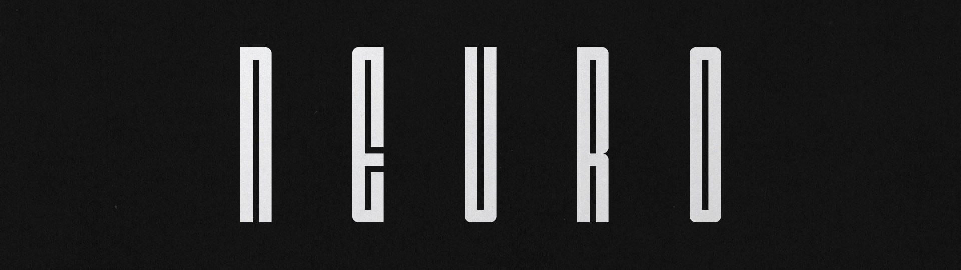
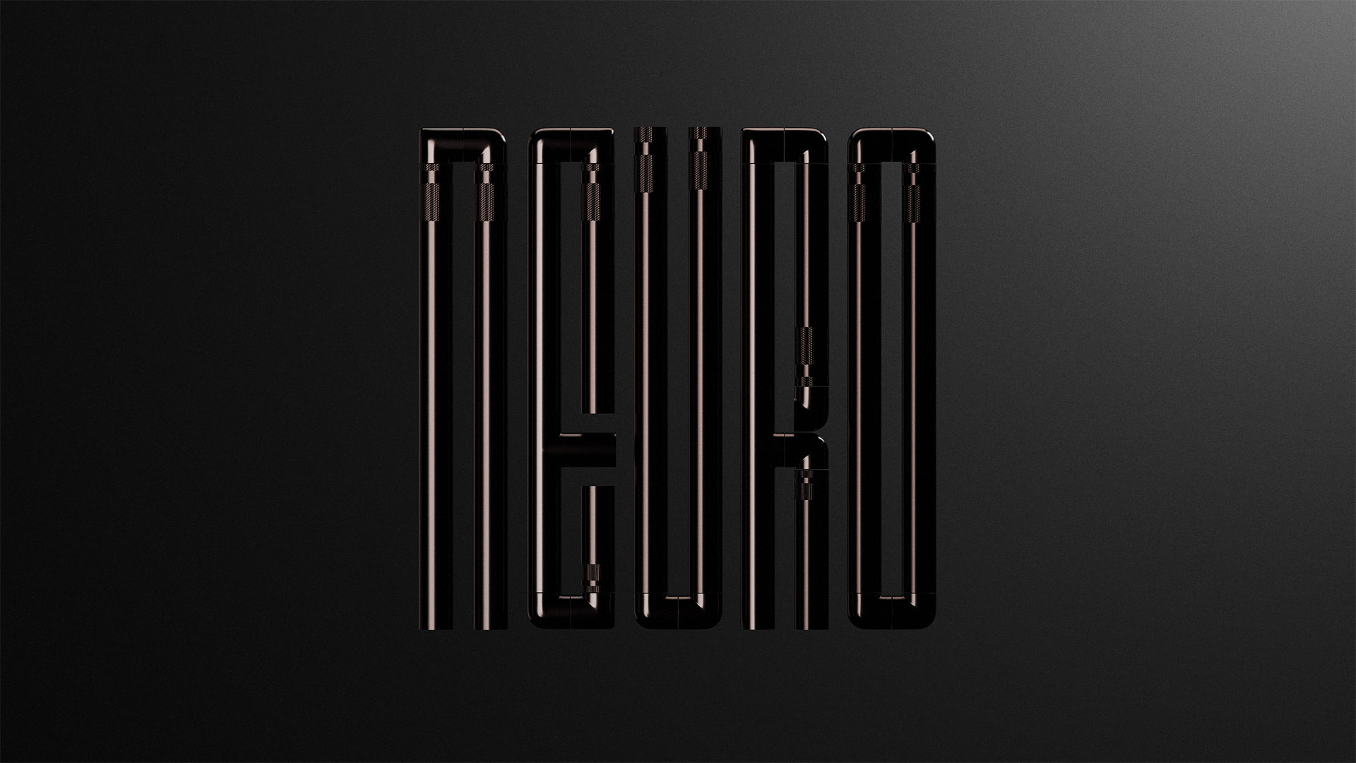
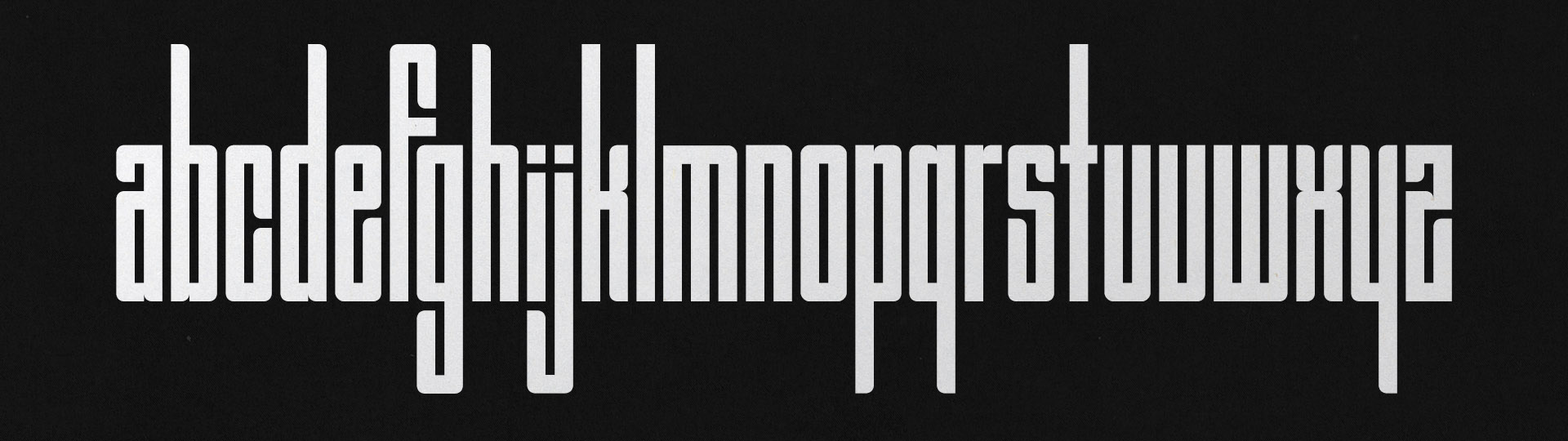
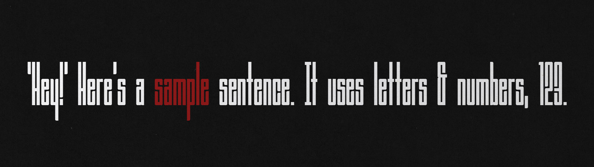
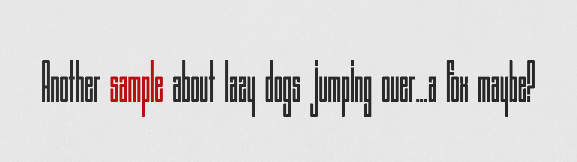
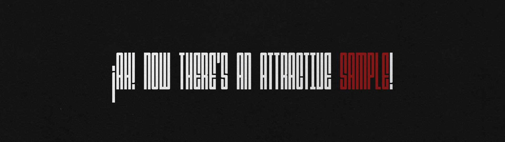
Neuro Typeface
I made a narrow, geometric, display typeface because I looooove narrow typefaces.
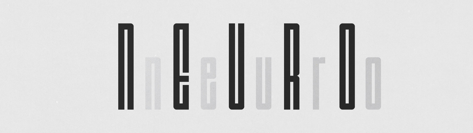
This typeface began with a desire to create something narrow and gridded that has a distinct character both when taken as a whole word or as individual characters. When closely spaces the negative spaces created between and within the letterforms start to construct a maze-like geometry, something that feels like it's own structured language. When spaced further apart the individual letterforms can shine and show off their unique and interesting geometries.
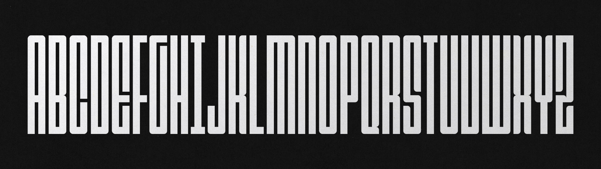
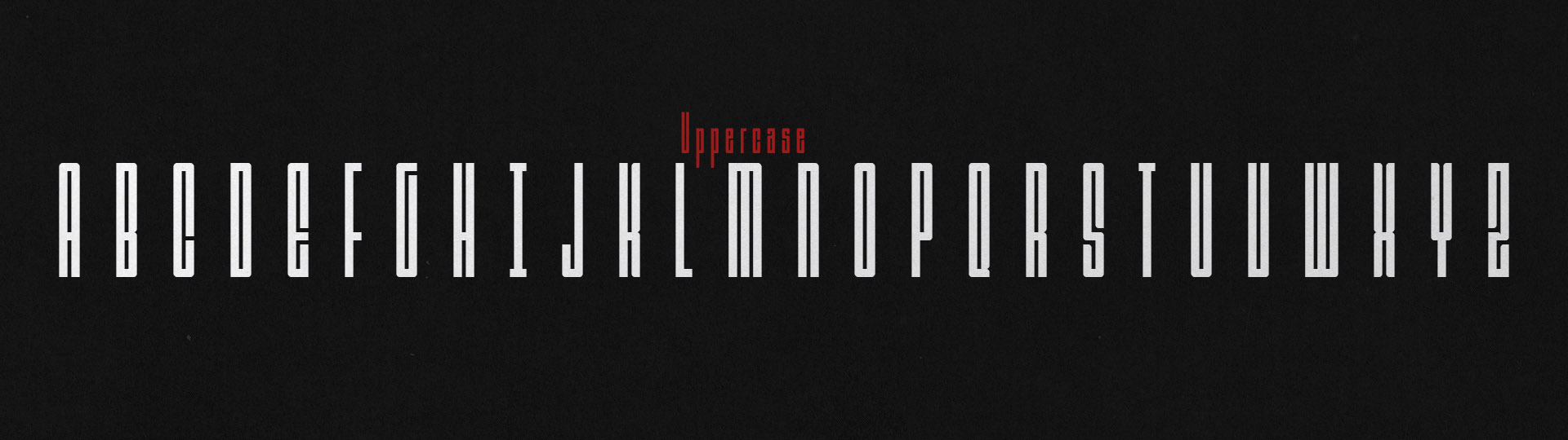
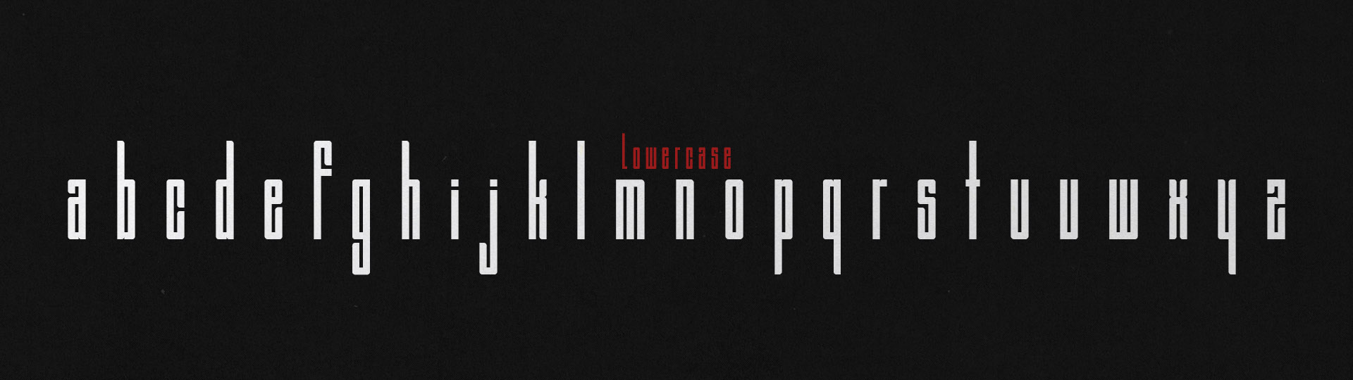
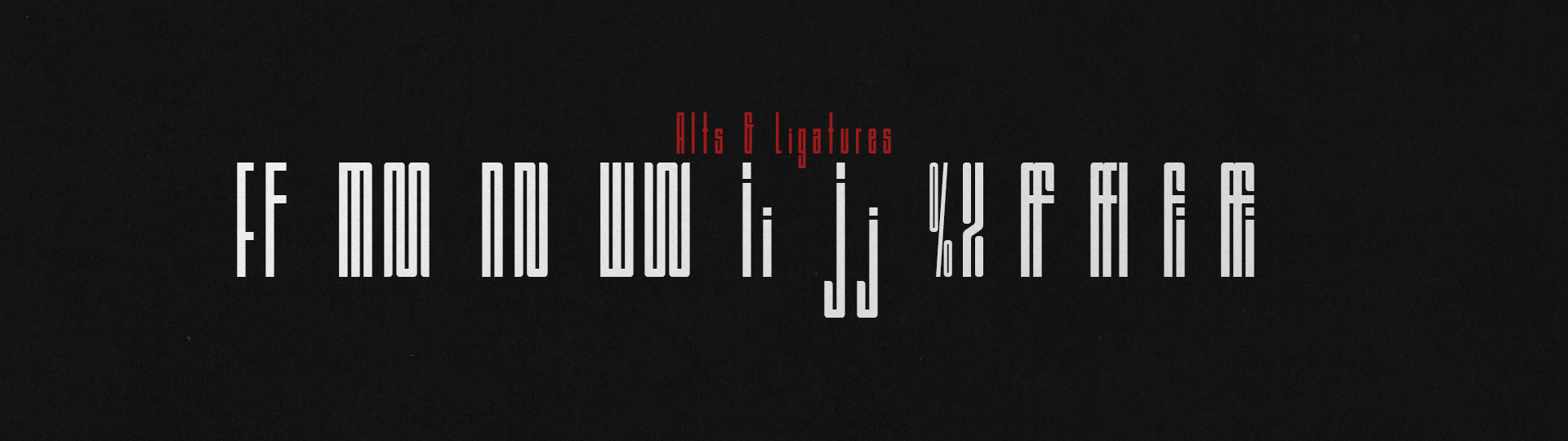
This typeface covers most of the Latin Simple character set including accents, symbols, and punctuation. Additionally there are a few alternate character options and some ligatures.