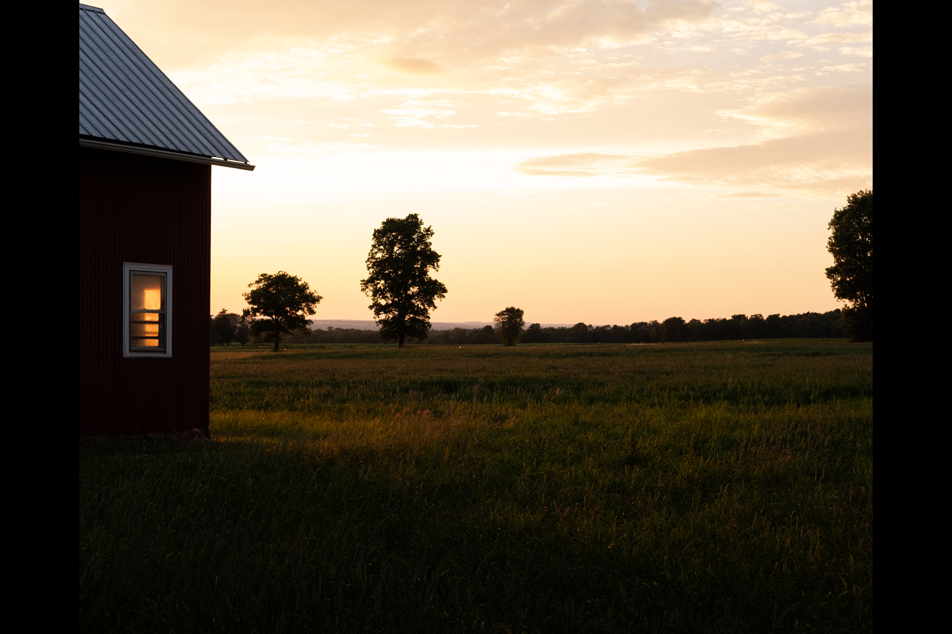
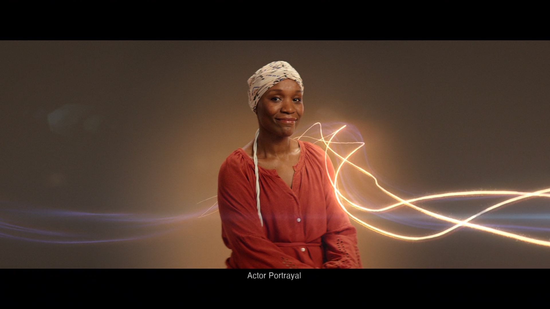
Stefan Draht
Providing a comprehensive approach to design–putting the audience and the user at the center of thought.
Design, motion, and creative direction.
-
Demoreel
It's been a minute. Lots of new work!
-
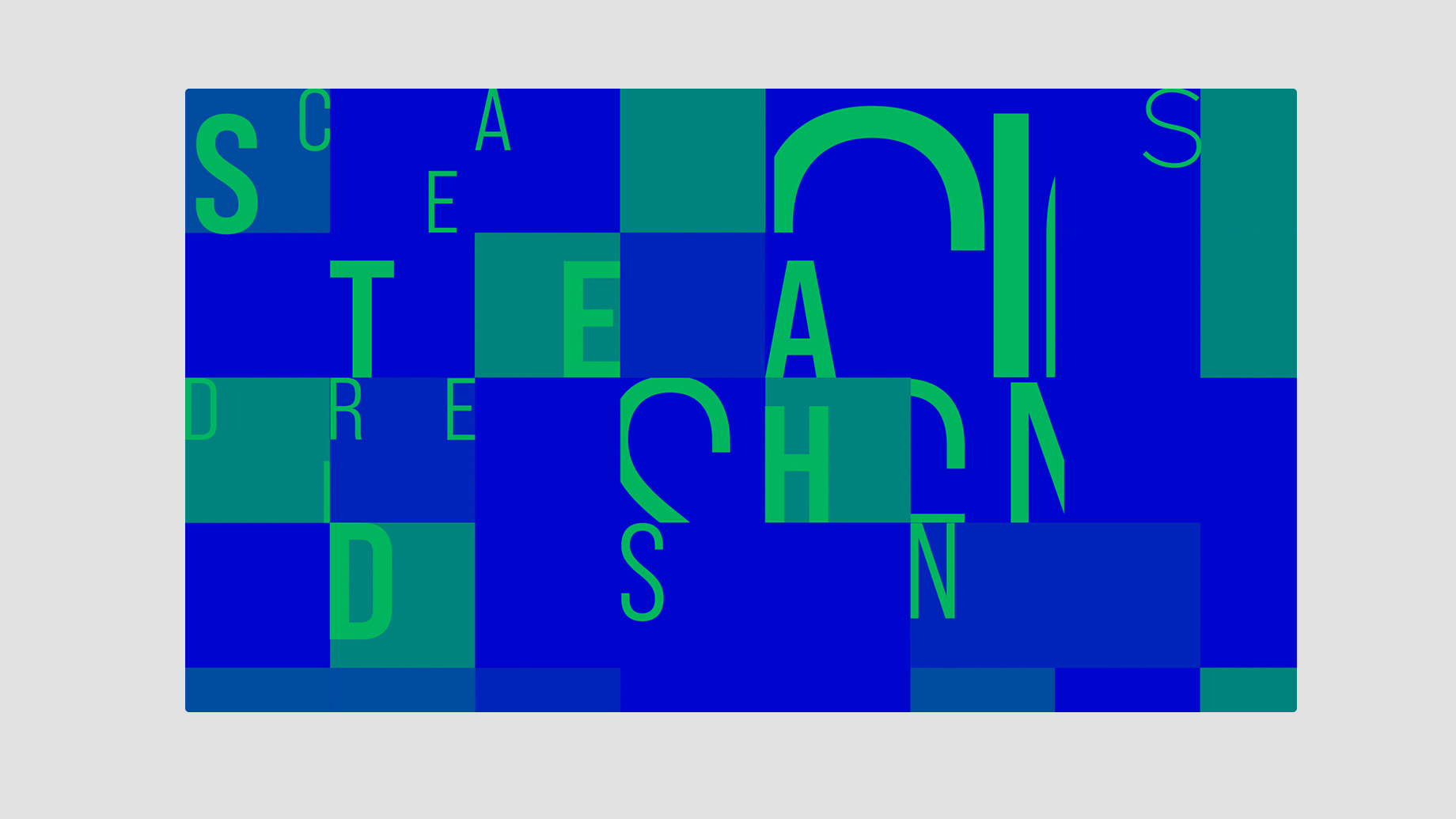
Kinetic Typgoraphy
Type is an important expression of a brand’s design language and central to communication. Movement brings the message and the brand to life.
-
Cash App: Live Event Animations
I worked with the Cash App team to design and animate looping event graphics for the event screens on the Kendrick Lamar tour.
-
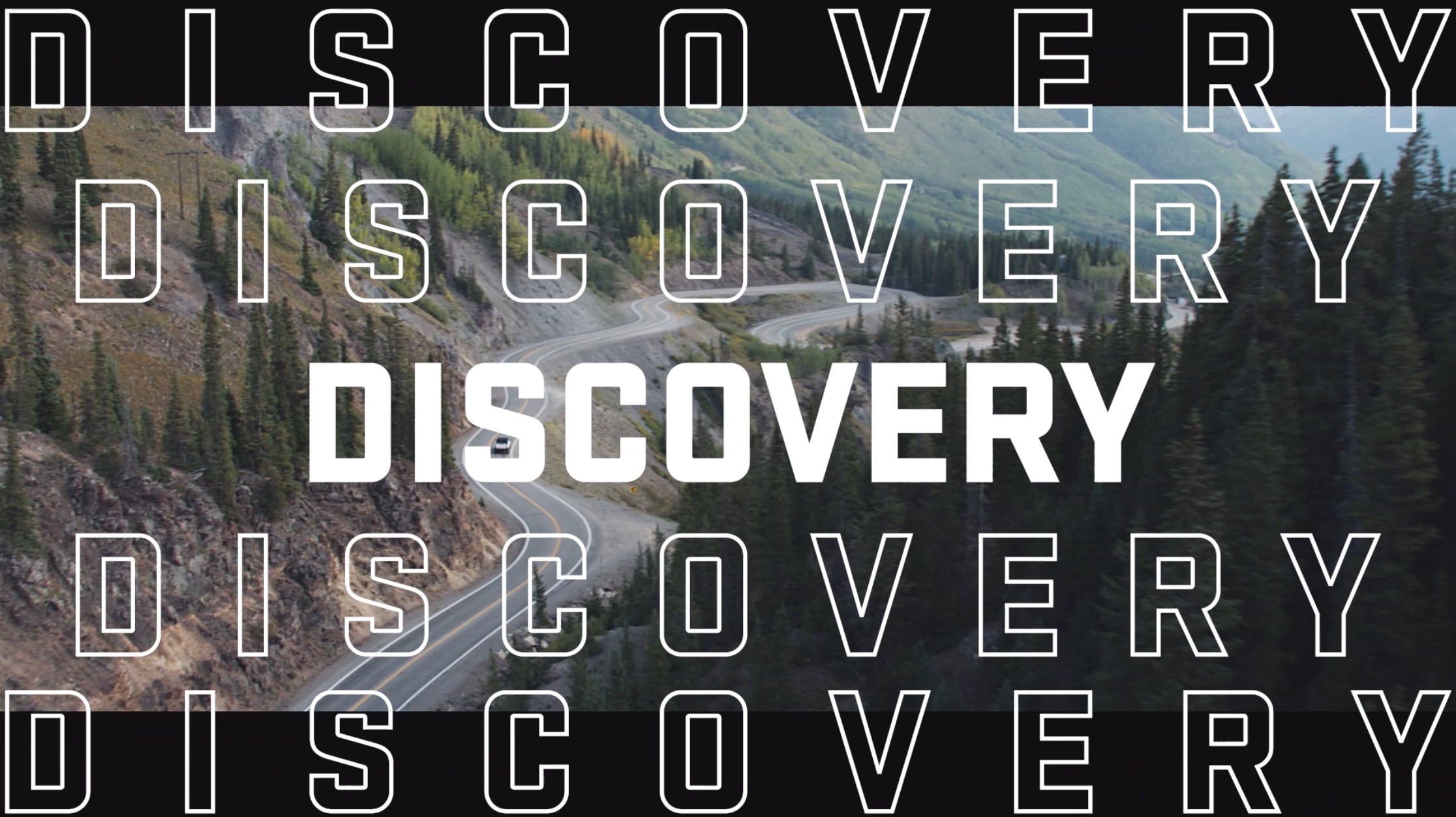
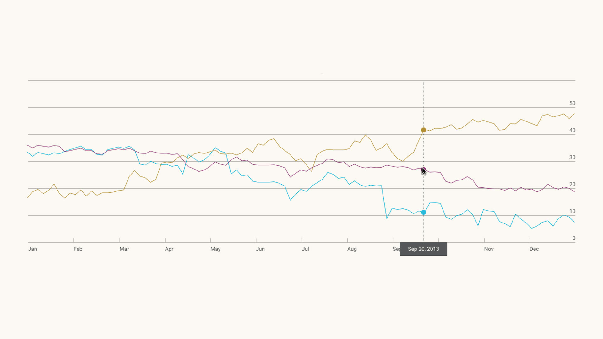
Northern Trust: Charting & Visualization
Imagining a new way of expressing the Northern Trust brand ethos through charting and data visualization, a mainstay of financial communication.
-
-
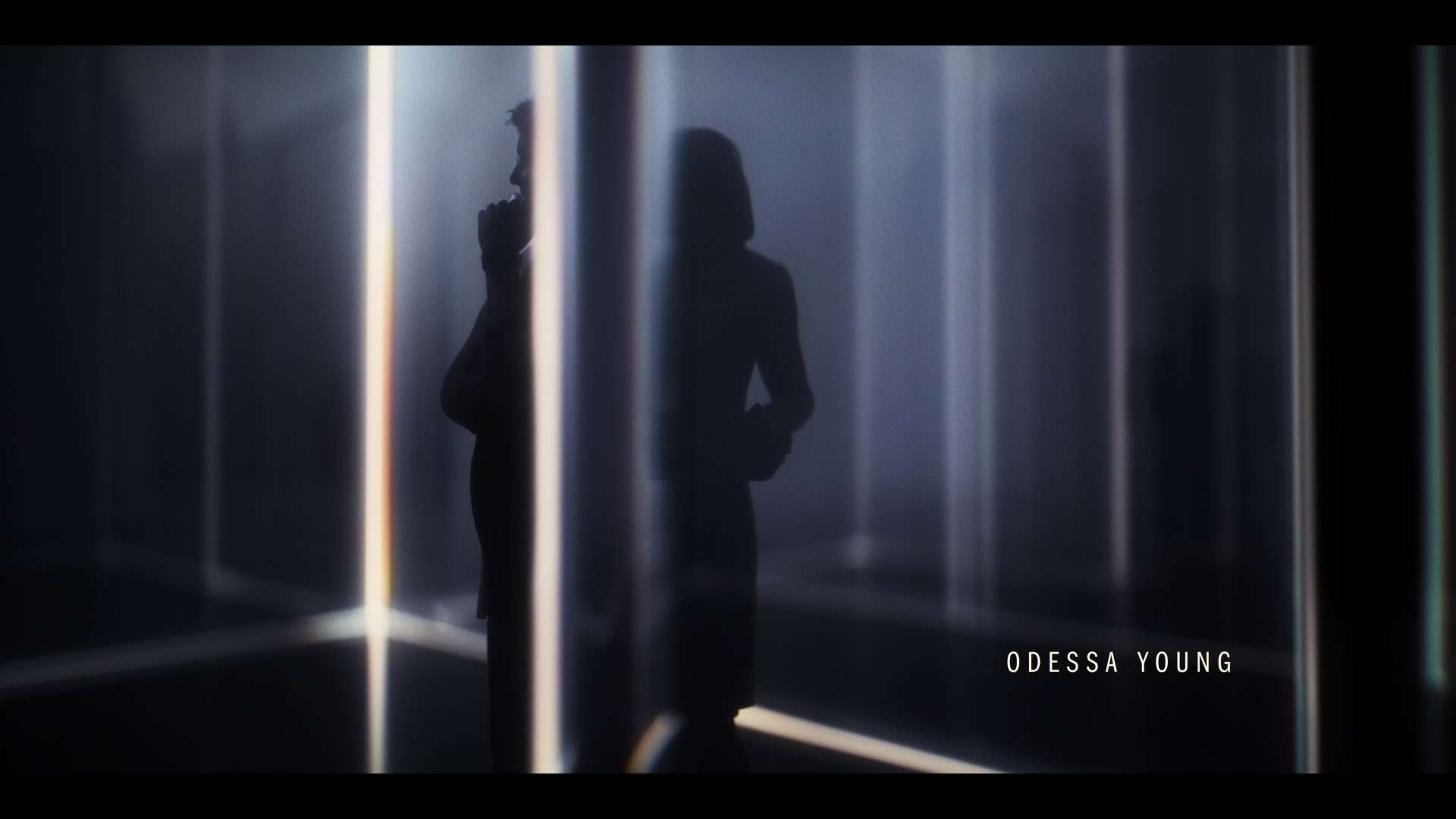
The Staircase: Title Sequence
It’s still a bit of a mystery, or matter of perspective, as to how Kathleen Peterson died. It’s been twenty years but it’s still a fascinating story replete with ambiguities and differing points of view. In creating this series director Antonio Campos wanted to defy the typical tropes of true-crime television and instead approach the story through the characters, their different motivations and experiences.
-
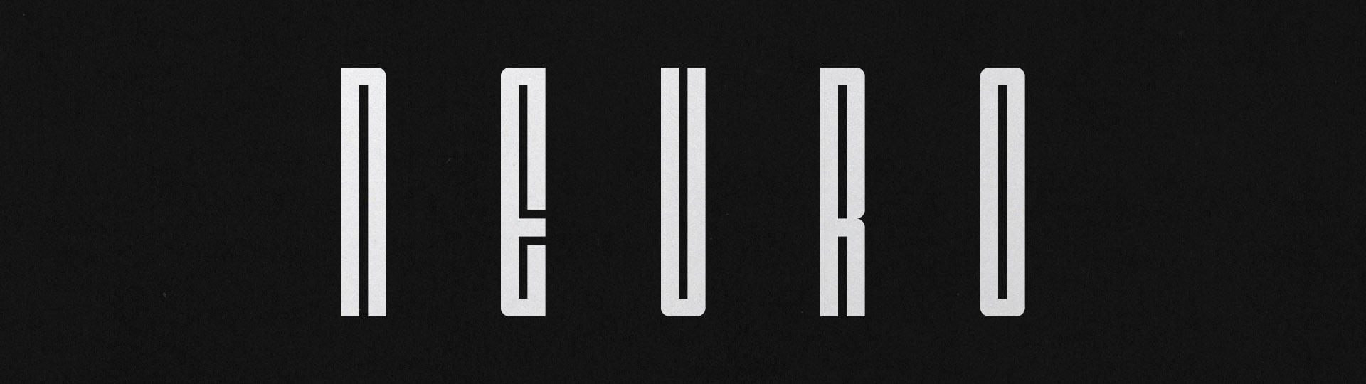
Neuro Typeface
I made a narrow, geometric, display typeface because I looooove narrow typefaces.
-
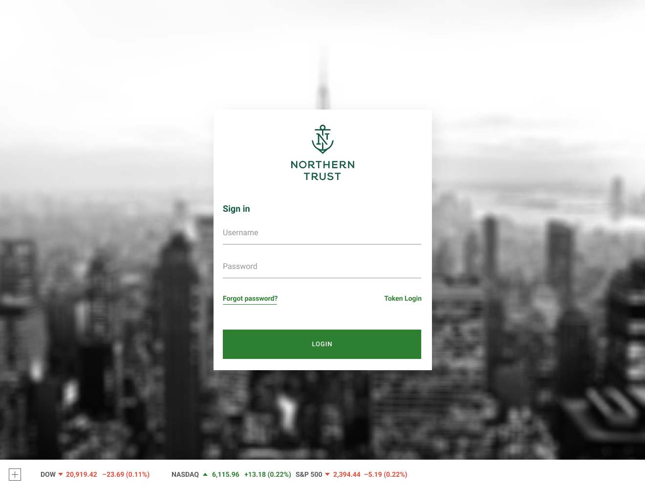
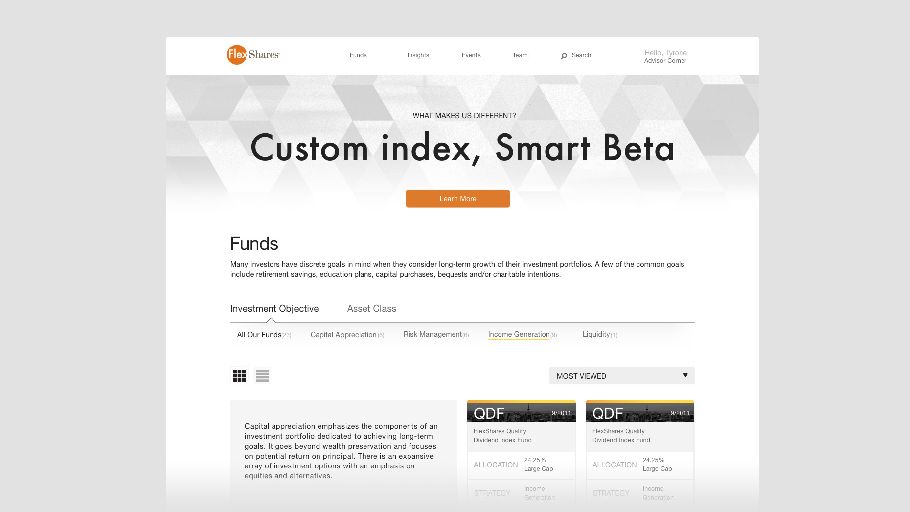
FlexShares: UX/UI
An early project for The Northern Lab at Northern Trust was to design a new experience for the FlexShares ETF product line.
-
Process and Practice
Explorations in process, constraint, structure and the practice of cultivating design language.
-
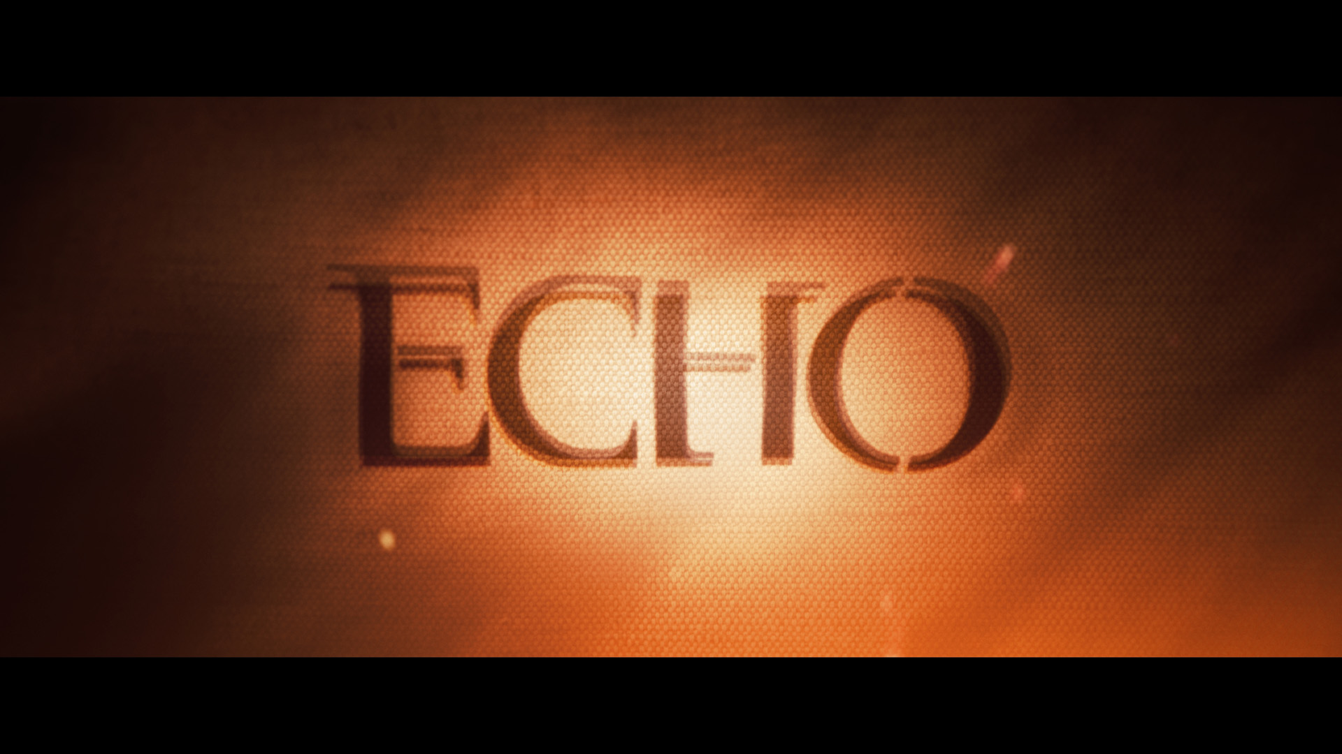
Marvel's Echo: Title Sequence
Maya is torn between two identities while also in the process of discovering a power within her that is a mystery and may even be a threat. She is surrounded by ominous forces on all sides. It was important that the title sequence expressed this duality with both beauty and threat.
-
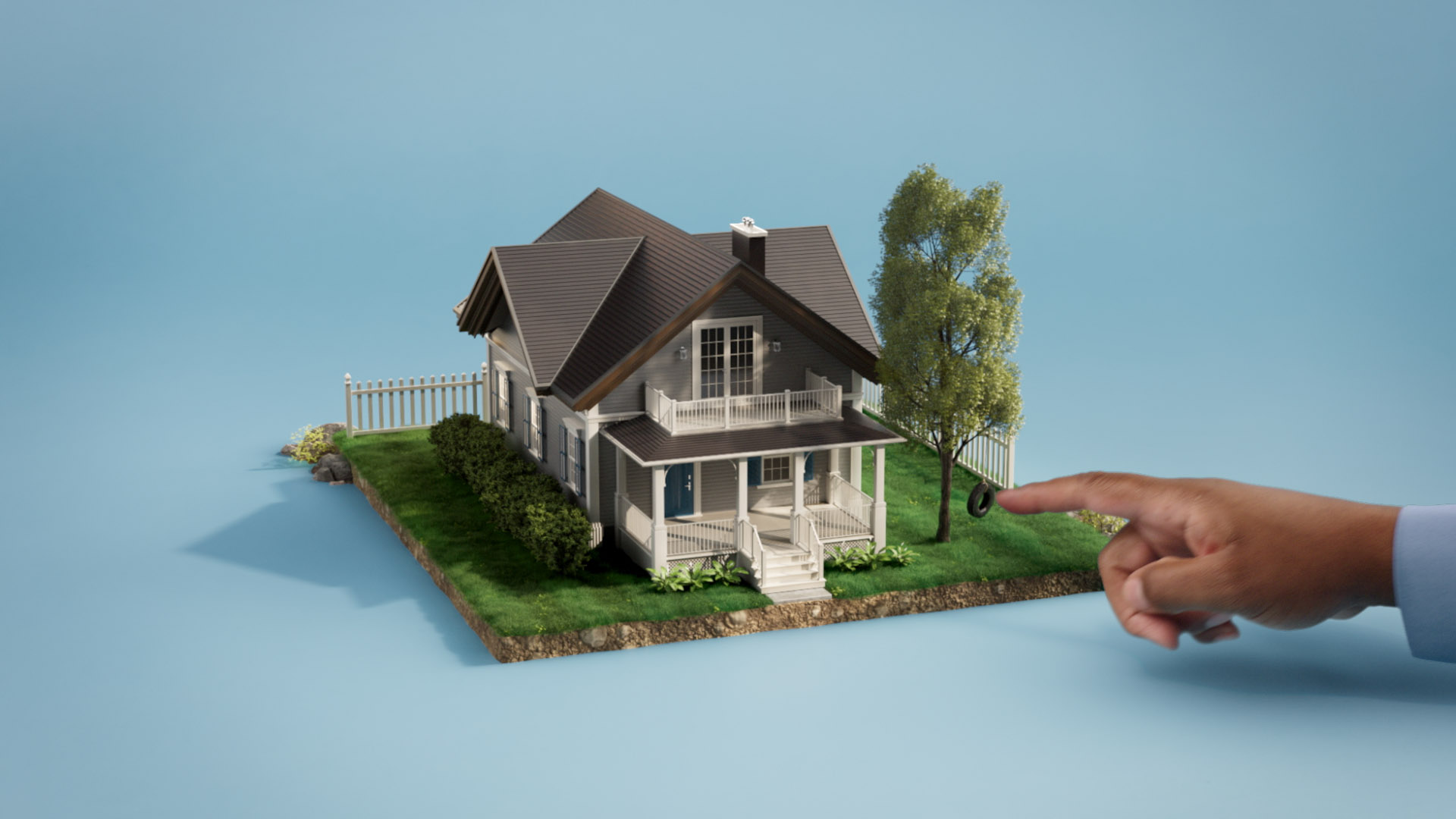
Landmark Credit Union: Banking Made Easy
Cramer-Krasselt approached Sarofsky with a simple and approachable idea: let’s use miniature vignettes to tell the stories of how Landmark Credit Union can step in to make banking easy for customers. I directed a team of designers, animators, and filmers to bring to life these micro-stories using a blend of live action interactions and CG elements.
-
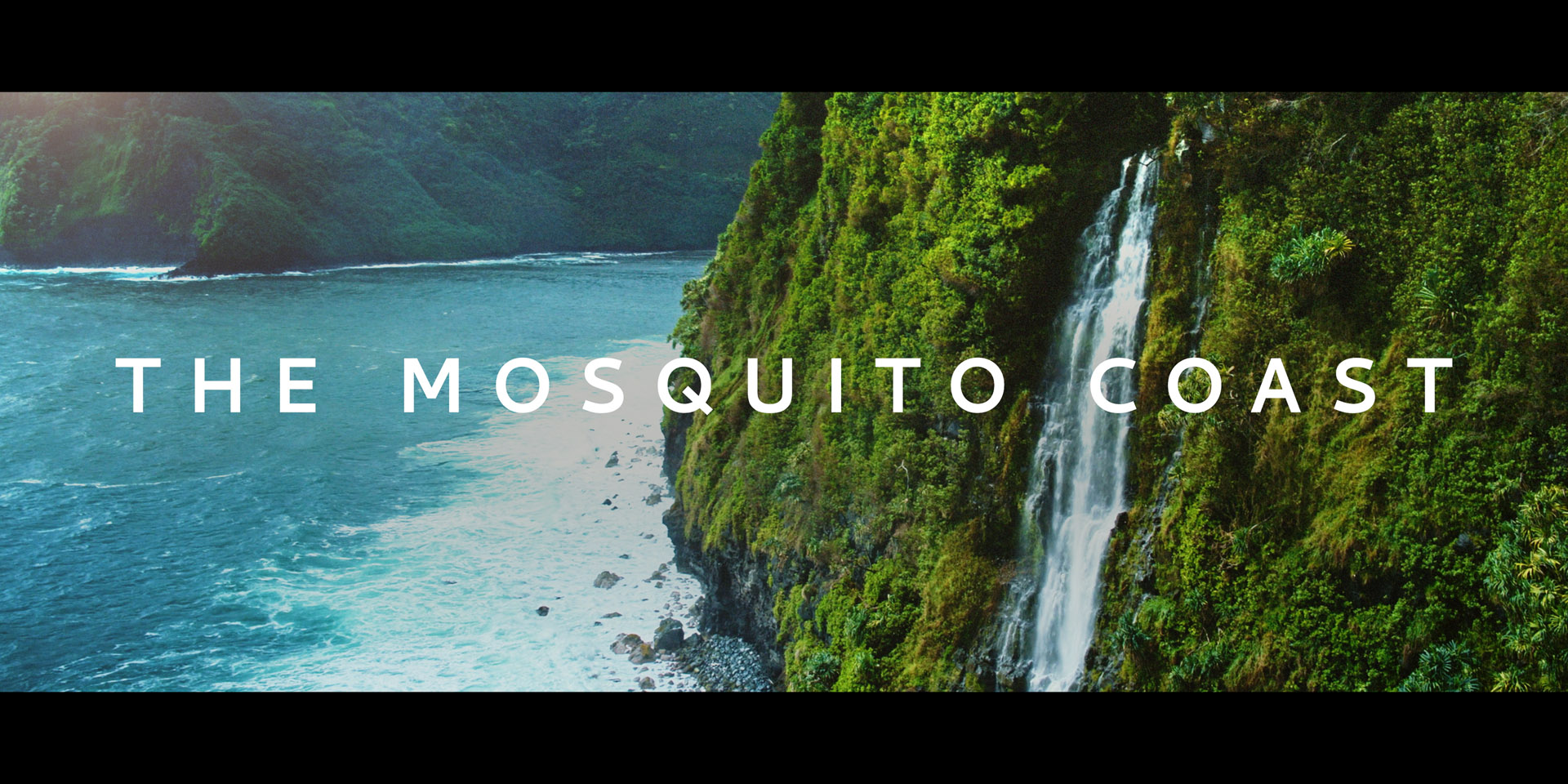
The Mosquito Coast: Title Sequence
Adapted for a television series by Neil Cross and Tom Bissell, The Mosquito Coast tells the story of a family on the run. Each member of the family has their own motivations and subplots that all act in concert or tension with the family patriarch’s (Justin Theroux) genius, idealism, and history. It was important to capture within the title sequence this sense of interweaving stories and ratcheting tension.
-
Northern Lab: Entryway Experience
A live, interactive experience developed for the entryway of Northern Trust's Client & Partner Experience studio (otherwise known as The Northern Lab).
-
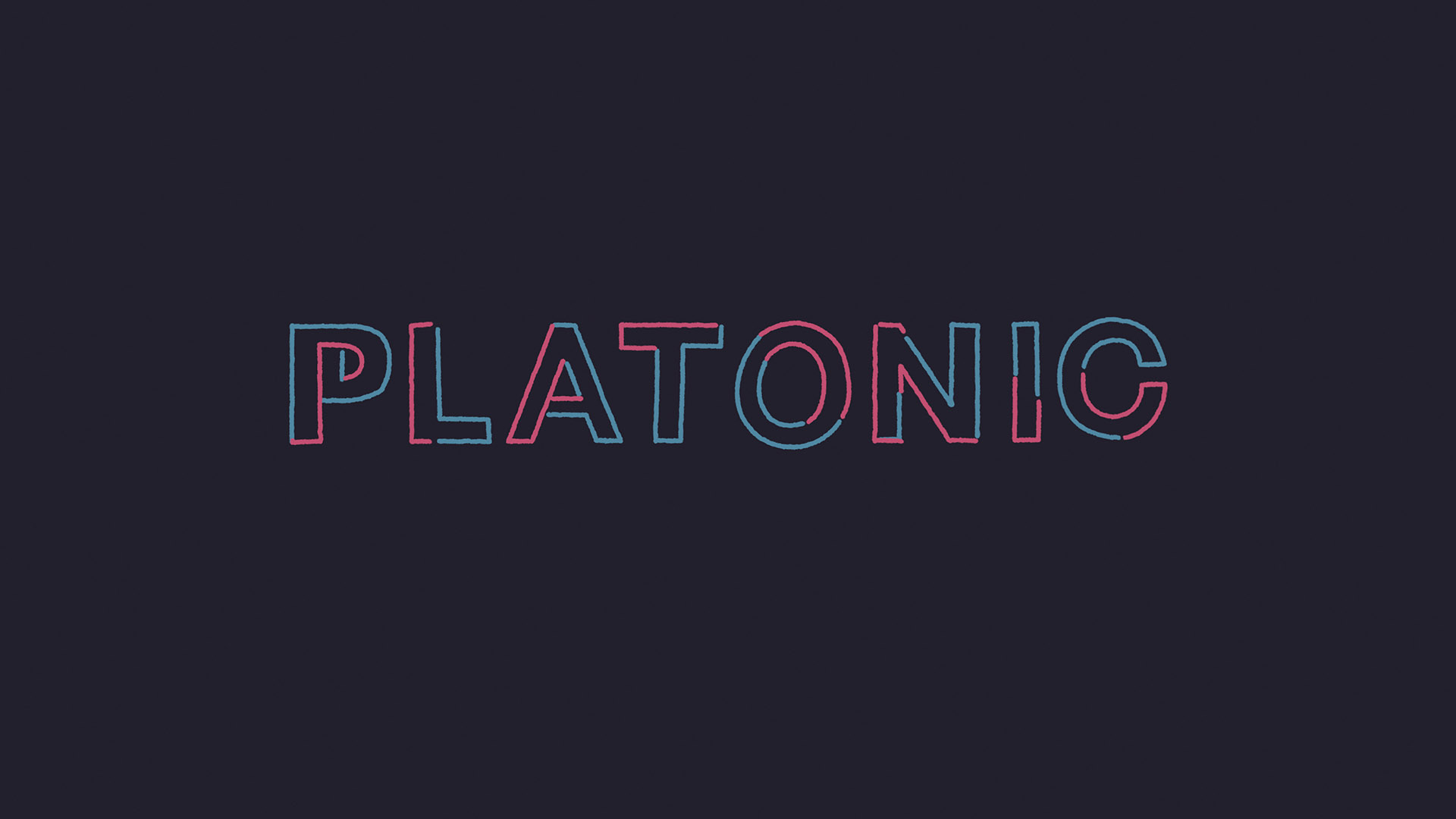
Platonic: Title Sequence
The strands in the Platonic title sequence are a visual metaphor for the relationship between the two main characters, Will and Sylvia. It follows two lines that drift apart and then come back together to cause a bit of chaos. The lines dance together, collide, drift apart and occasionally explode just as Will (Seth Rogen) and Sylvia (Rose Byrne) do throughout the show.
-
FLUX: Website Animations
Working with(link: http://www.usklf.com text:Kyle Fletcher's illustrations I brought motion and life to the vignettes for use on the FLUX website.
-
Novocure: Optune Gio
Helping to visualize the healing energy frequencies of Novocure’s Optune Gio technology. Finding a sense of gentle, flowing energy that lives within a cinematic production style.
-
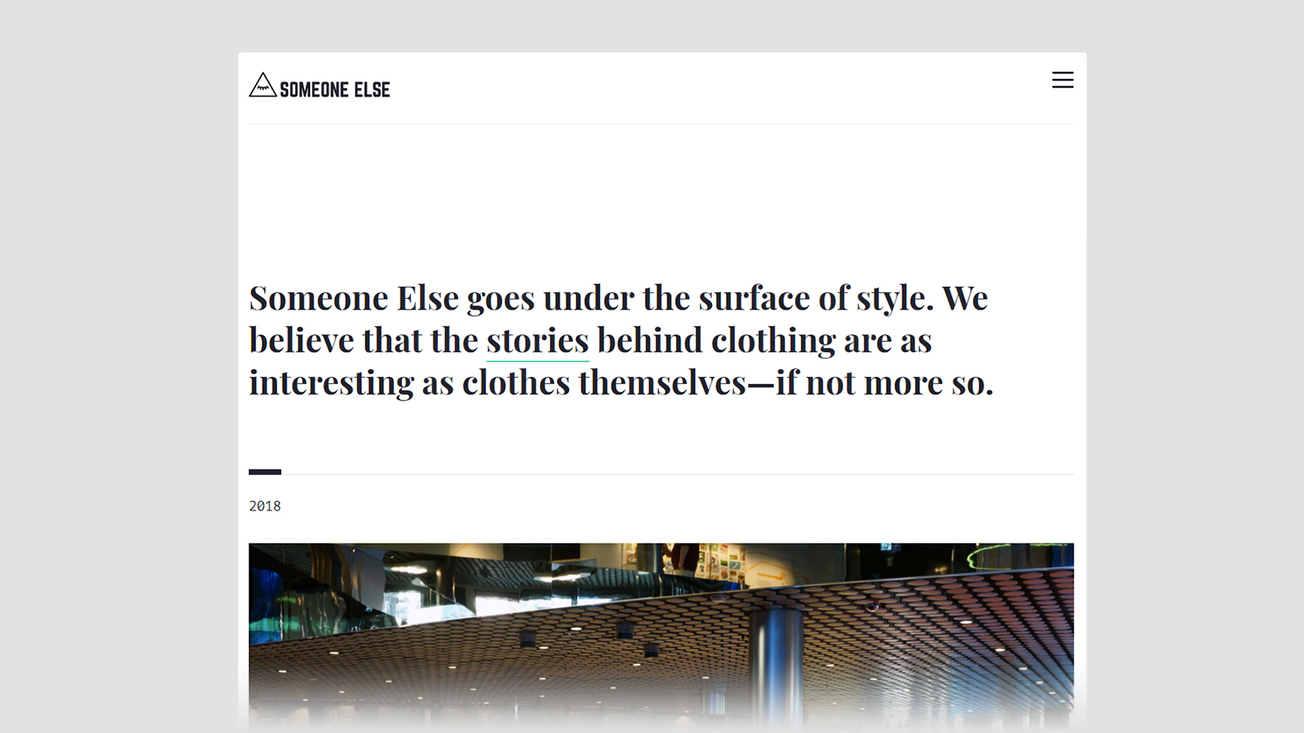
Someone Else: Site and Branding
Someone Else sprang from Joe Jarvis' passion and curiosity for the why behind independent fashion and style. We work hard to marry a slow-journalism approach to writing with design and photography, treating it all as a singular, nuanced product.
-
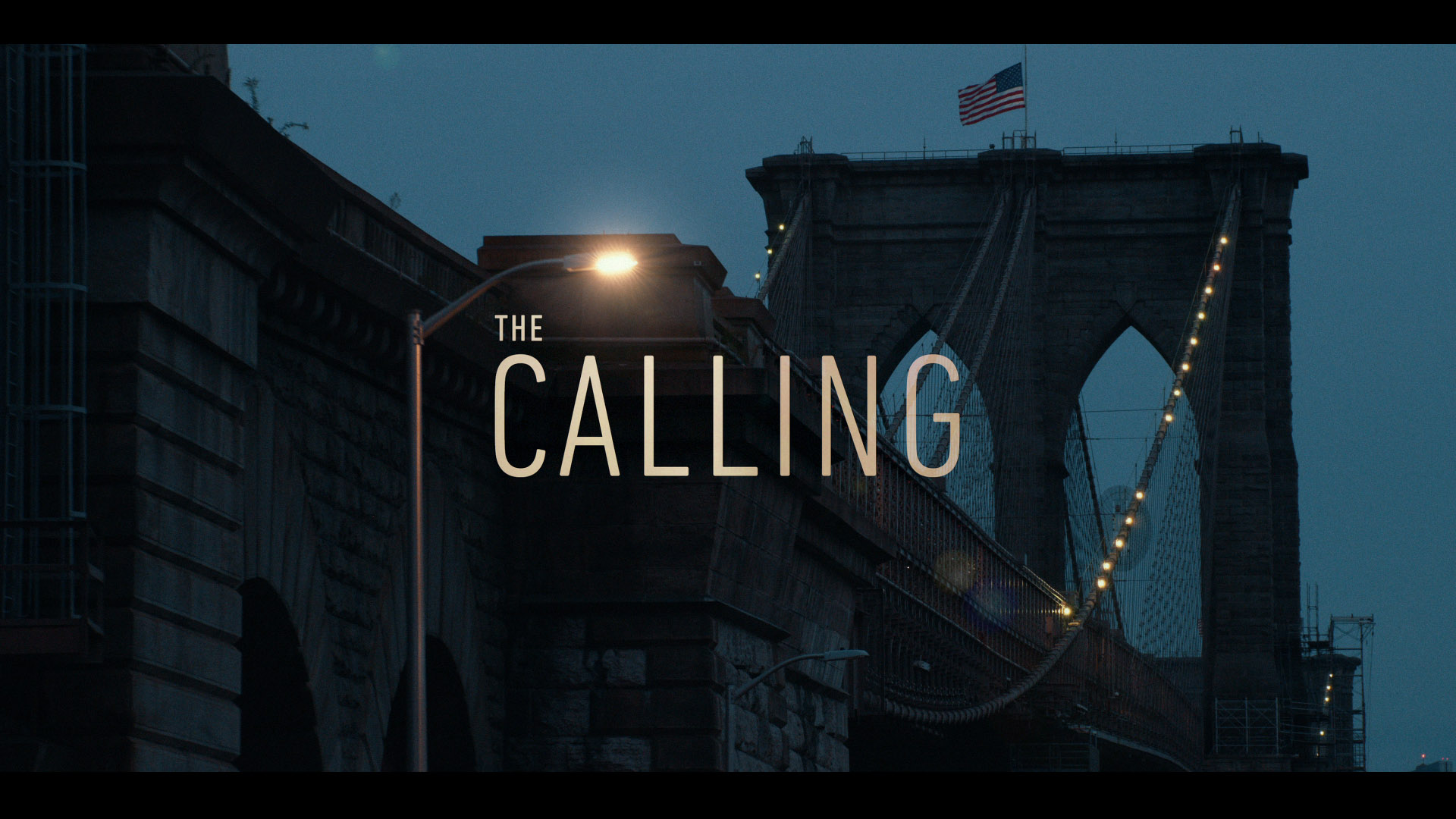
The Calling: Title Sequence
Main titles designed for the Peacock original show The Calling.
-
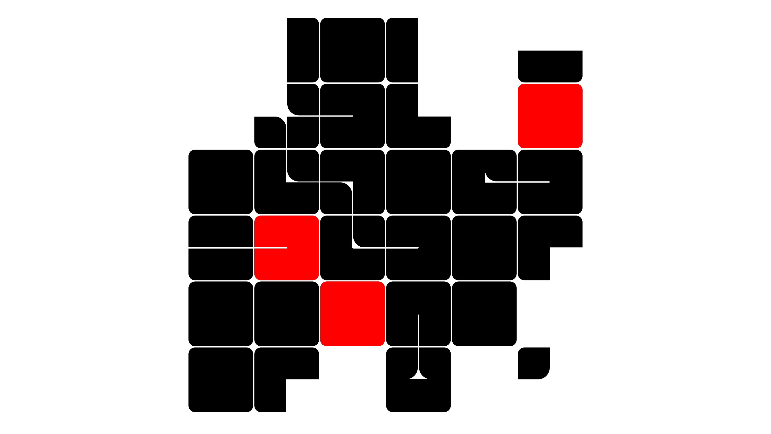
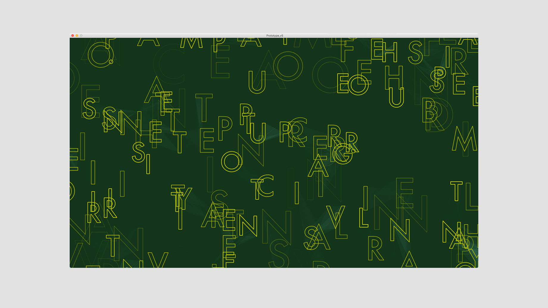
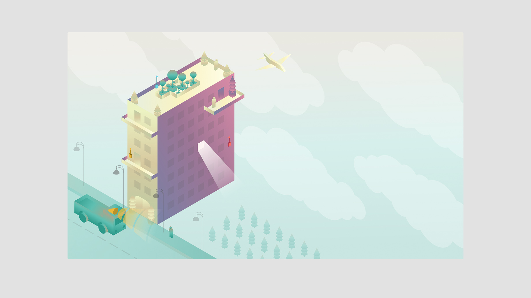
Concepts & Styleframes
Styleframes from the archives and the boneyard.
-
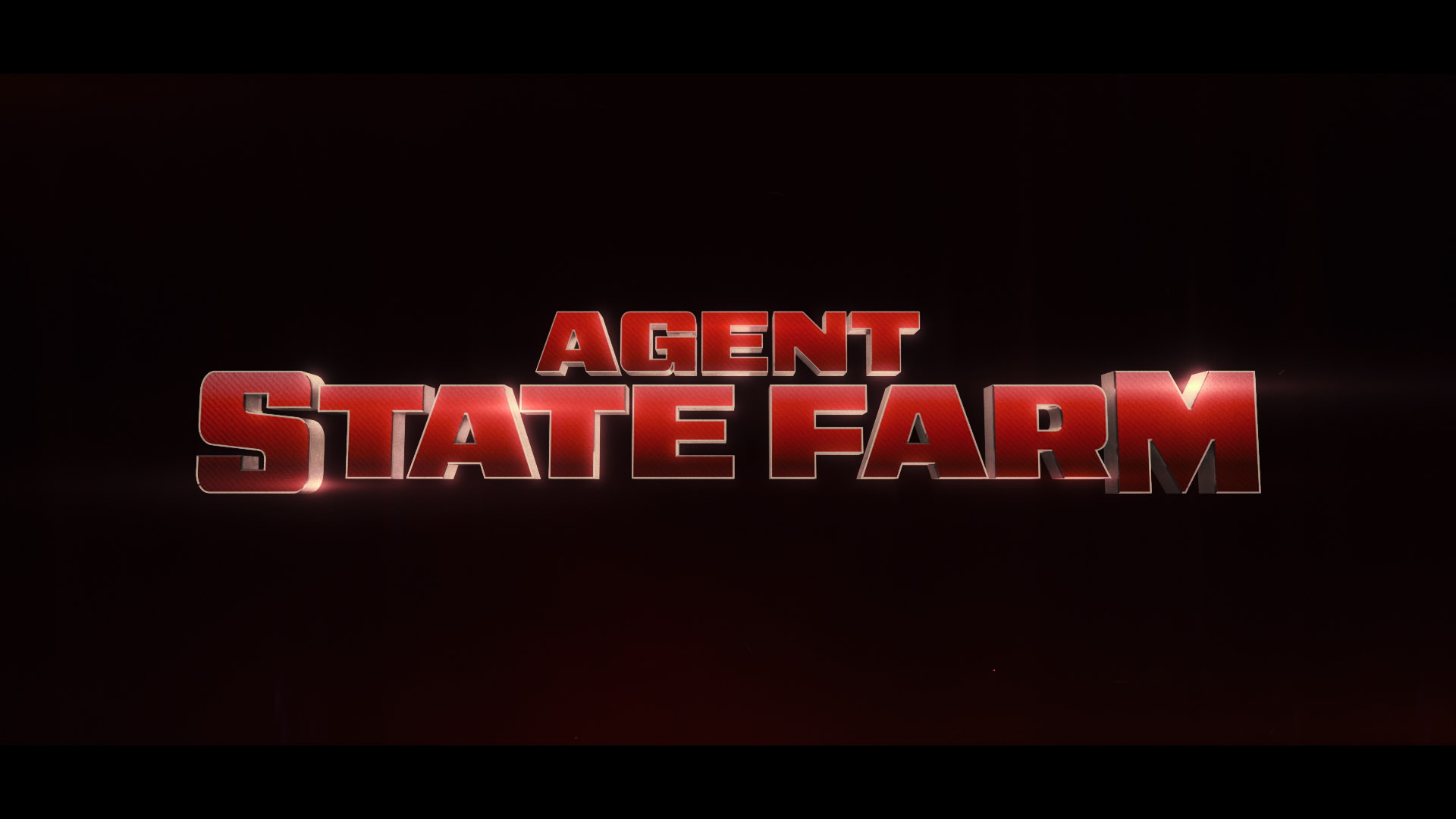
Agent State Farm: Teaser and Titles
When High Dive decided to make a sixty second movie, that’s definitely not a commercial, for State Farm’s Superbowl ad they treated it like a full on Hollywood production. Naturally they turned to a team with vast experience in title design for entertainment.
-
Quarter Zero: Logo/UI Animation
I Brought to life the logo designs of Kyle Fletcher for Quarter Zero to use in their user interfaces.
-
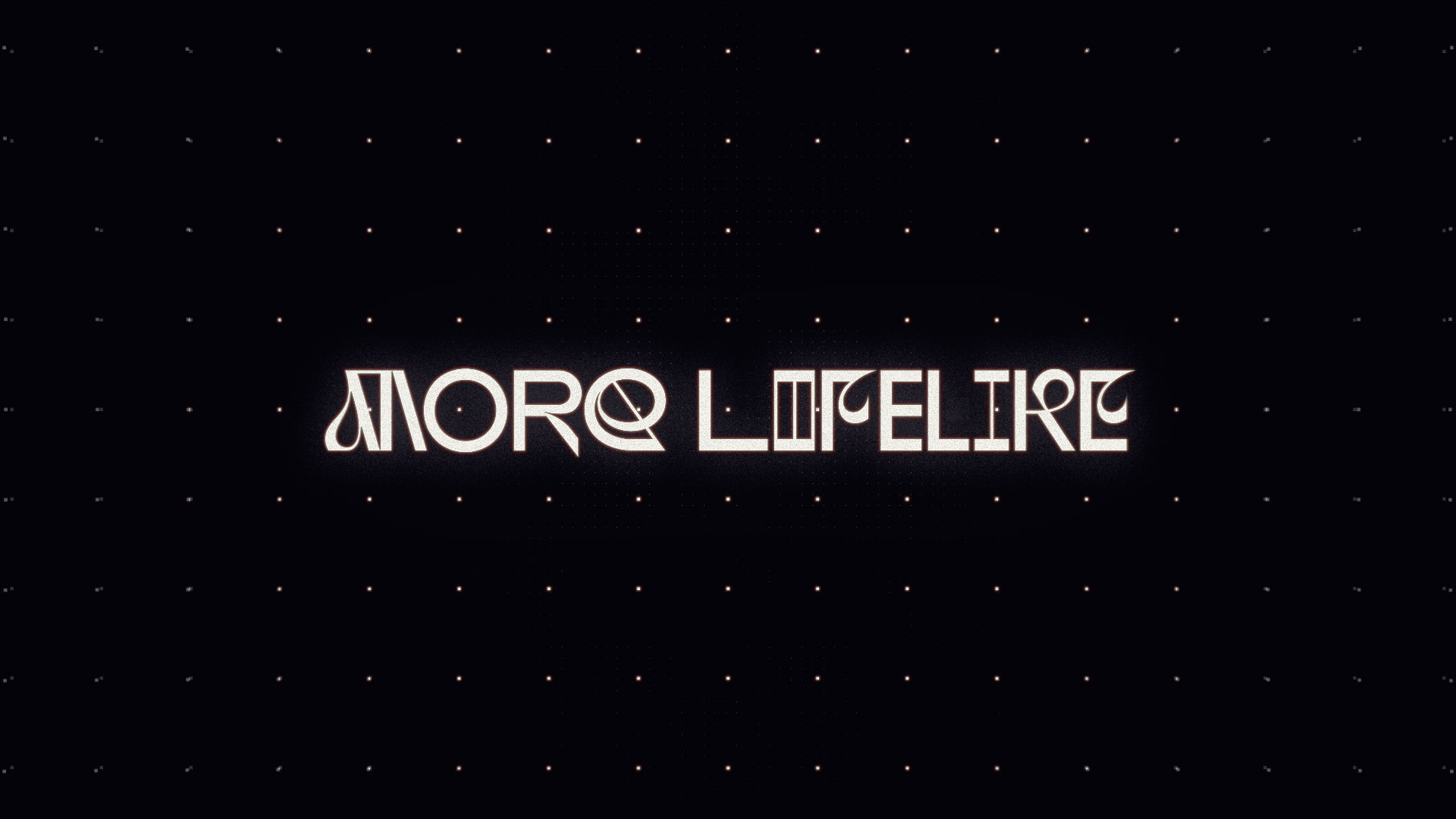
More Lifelike: Music Video
I collaborated with Sunjacket to help them visualize the tone and mood of More Lifelike, the title track off of their 2021 album.
-
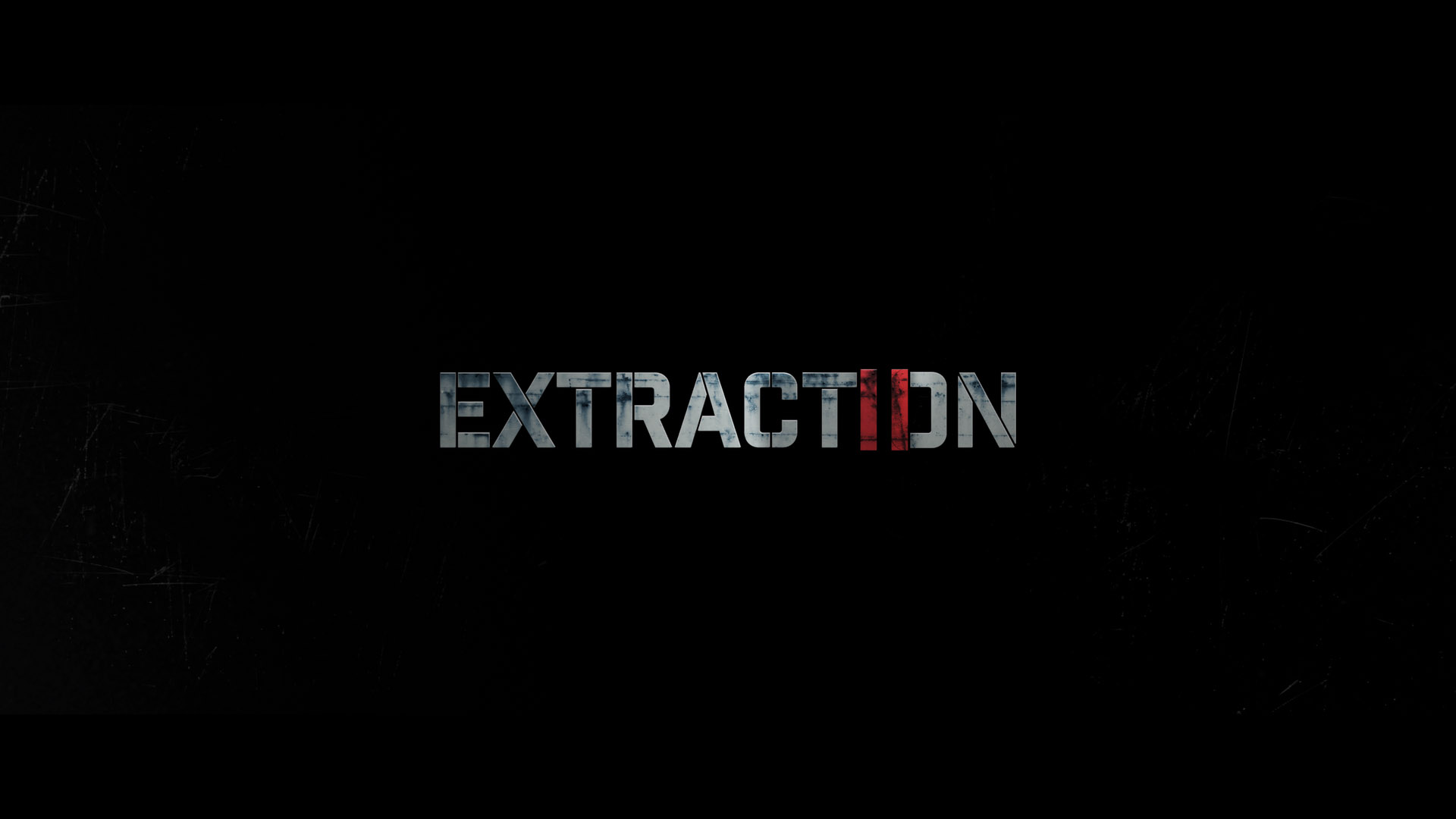
Extraction II: Title Sequence
The sequel to Sam Hargrave’s tour de force ratchets up the impact and intensity and needed a title design that feels spiritually connected to the same classic action films which inspired its aesthetic.
-
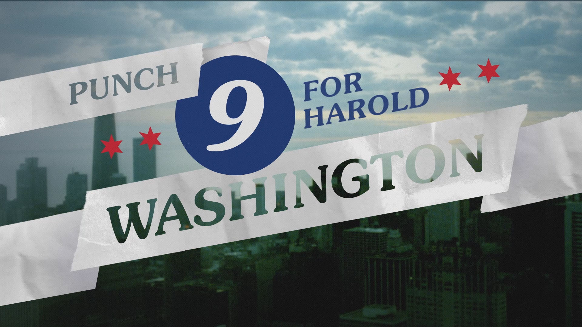
Punch 9: Title Sequence
Punch 9 refers to the campaign to elect Harold Washington as Chicago's first African American mayor in 1983. The title sequence for the documentary film needed to capture the era, the city, and the cultural tensions of the moment; feeling simultaneously vintage and modern.
-
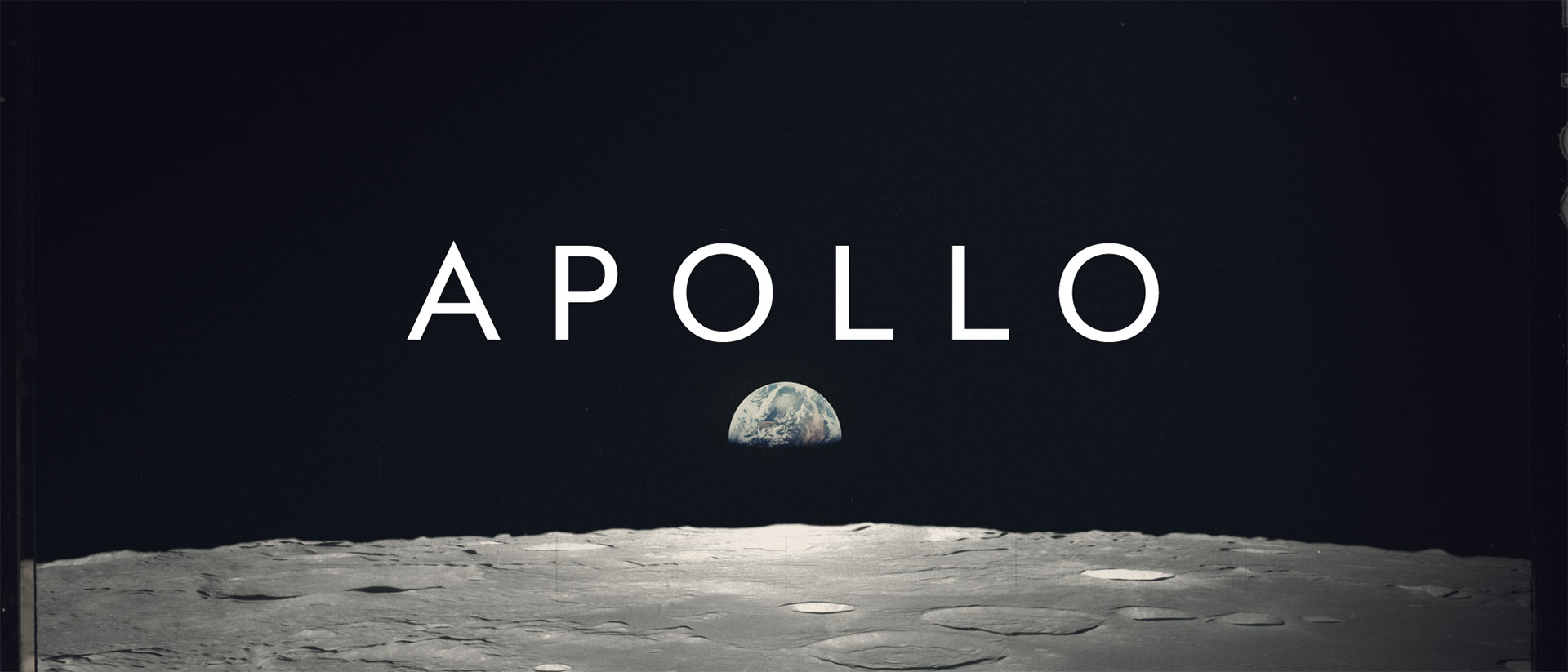
Apollo: Experimental Title Sequence
What began as a small weekend exploration of the NASA Apollo photo archive turned into a multi-month project to create a full-blown title sequence memorializing the missions to the moon.
-
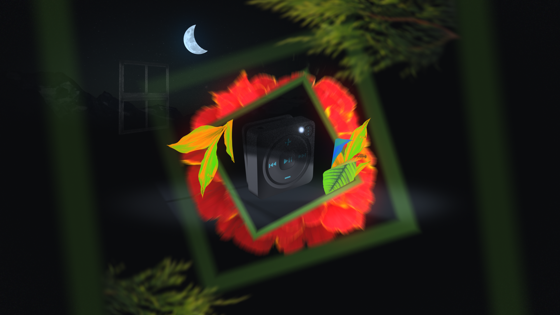
Mighty: Stay Fresh
An animated video for Mighty highlighting the Stay Fresh feature of their devices–syncing your playlists while you sleep.
-
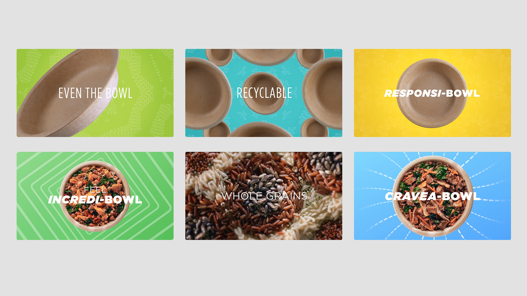
Healthy Choice–Power Bowl: Design Explore
Adding energy and motion to the ingredients of Healthy Choice's new Power Bowls at Sarofsky in Chicago.
-
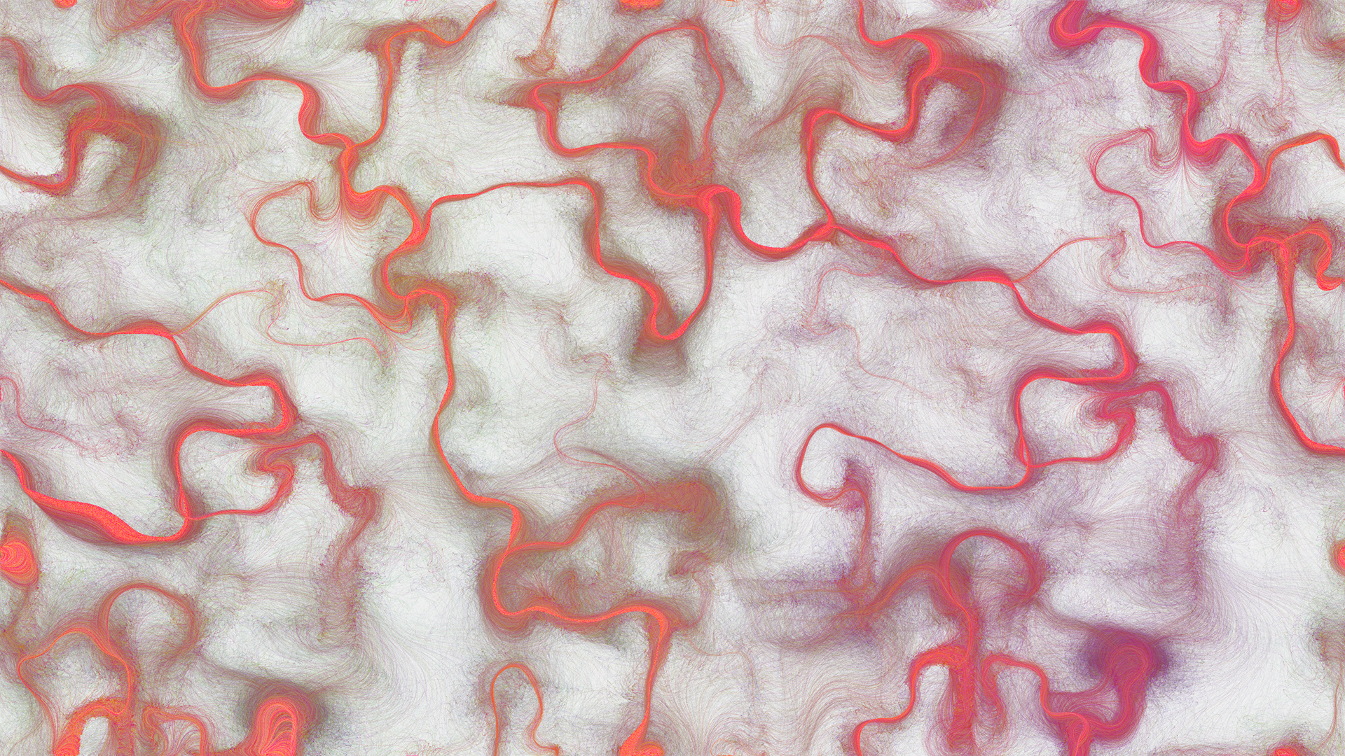
Flow Painting: Design & Application
An application for creating interesting paintings out of flow fields and particle motions.
-
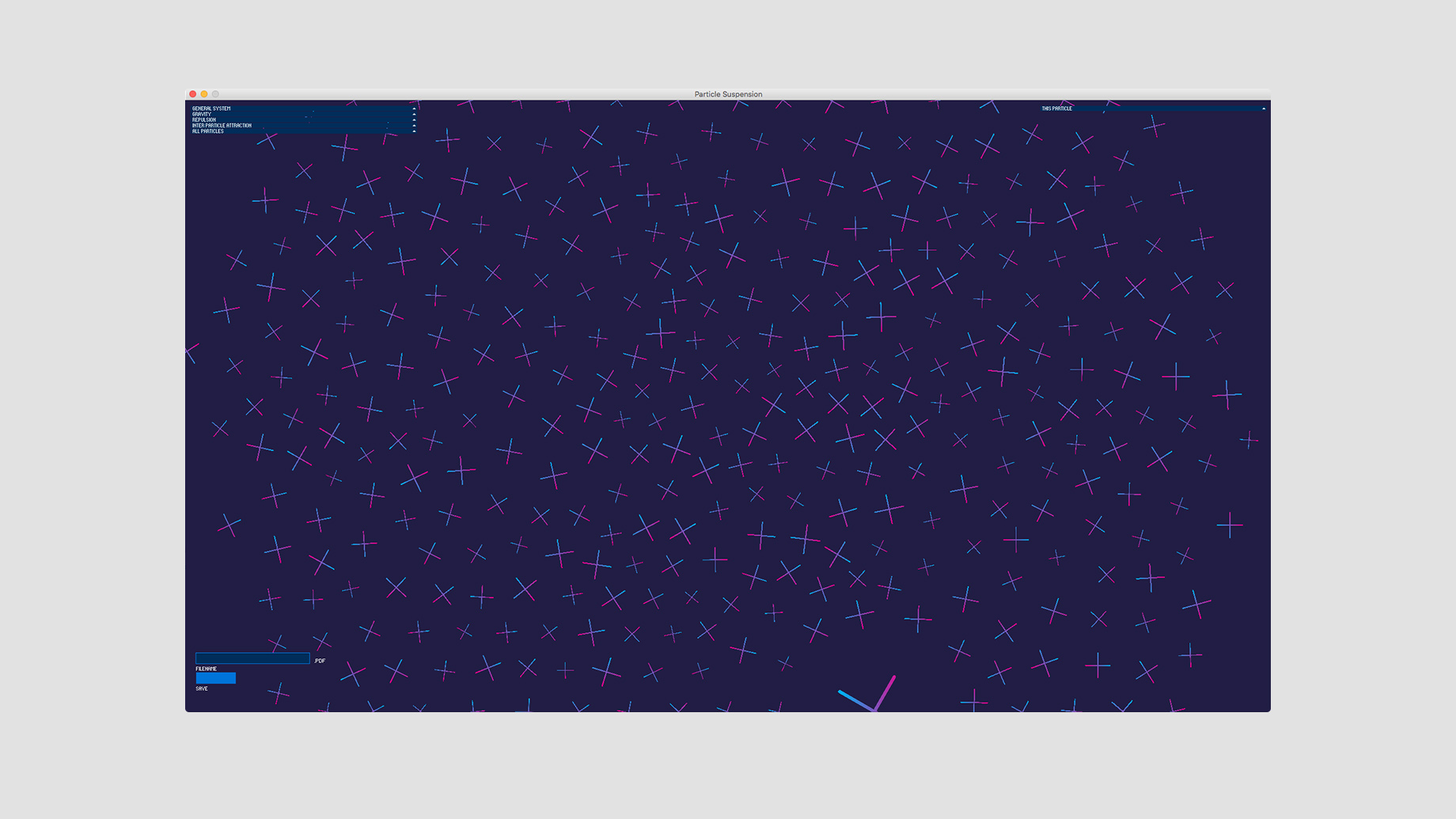
Bezier Line Flows: Design & Development
Creating a sense of flowing along generated bezier paths.
-
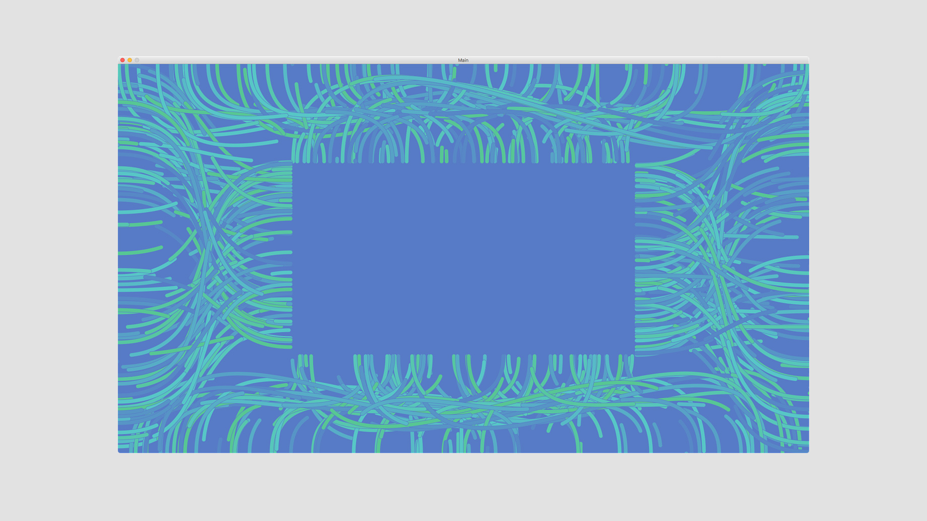
Grid Suspension: Design & Application
A tool for creating interesting layouts and non-traditional grids using the simulated interactions of round particles as the foundation.
-