Stefan Draht
Providing a comprehensive approach to design–putting the audience and the user at the center of thought.
Design, motion, and creative direction.
-
The Staircase: Title Sequence
It’s still a bit of a mystery, or matter of perspective, as to how Kathleen Peterson died. It’s been twenty years but it’s still a fascinating story replete with ambiguities and differing points of view. In creating this series director Antonio Campos wanted to defy the typical tropes of true-crime television and instead approach the story through the characters, their different motivations and experiences.
-
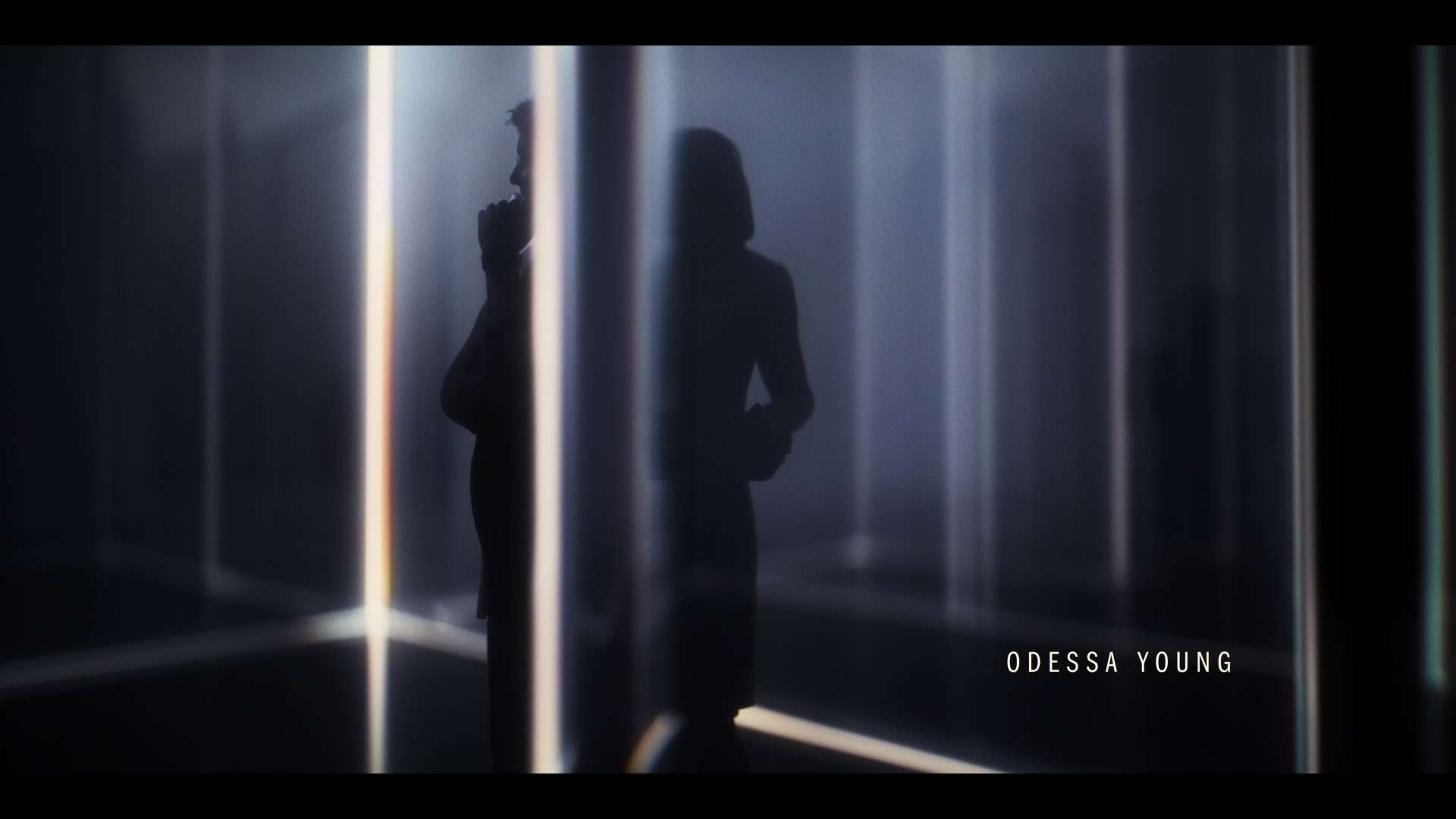
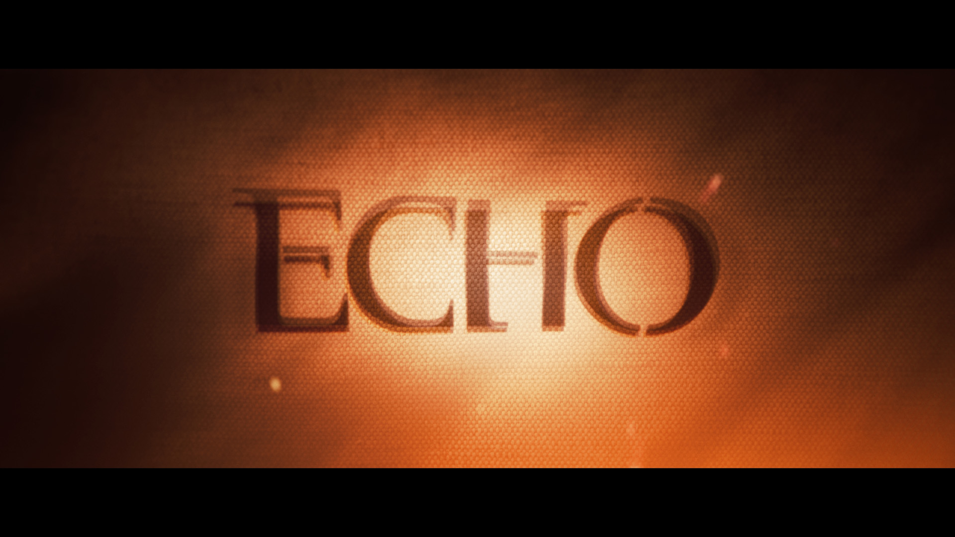
Marvel's Echo: Title Sequence
Maya is torn between two identities while also in the process of discovering a power within her that is a mystery and may even be a threat. She is surrounded by ominous forces on all sides. It was important that the title sequence expressed this duality with both beauty and threat.
-
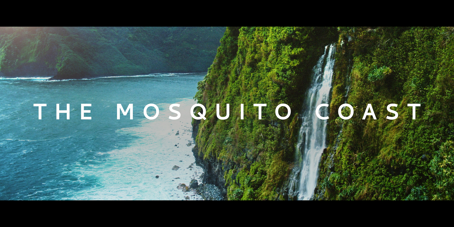
The Mosquito Coast: Title Sequence
Adapted for a television series by Neil Cross and Tom Bissell, The Mosquito Coast tells the story of a family on the run. Each member of the family has their own motivations and subplots that all act in concert or tension with the family patriarch’s (Justin Theroux) genius, idealism, and history. It was important to capture within the title sequence this sense of interweaving stories and ratcheting tension.
-
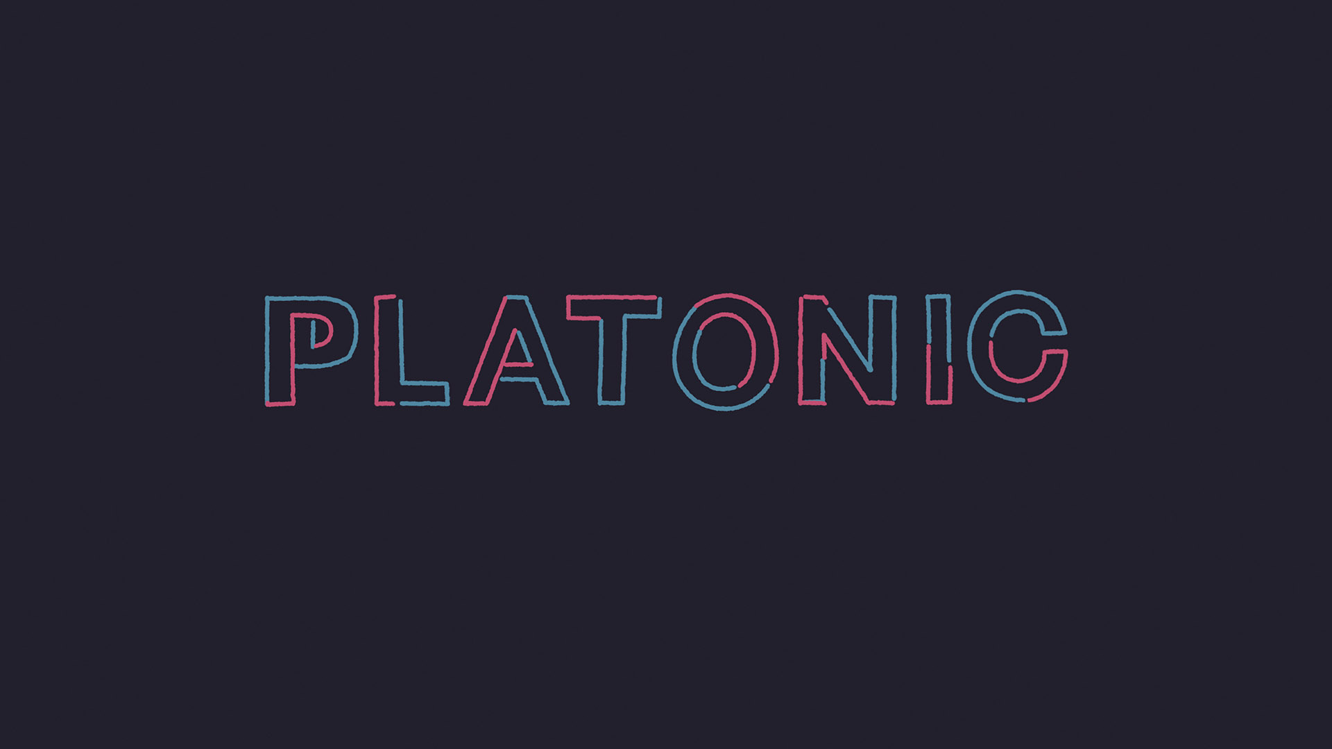
Platonic: Title Sequence
The strands in the Platonic title sequence are a visual metaphor for the relationship between the two main characters, Will and Sylvia. It follows two lines that drift apart and then come back together to cause a bit of chaos. The lines dance together, collide, drift apart and occasionally explode just as Will (Seth Rogen) and Sylvia (Rose Byrne) do throughout the show.
-
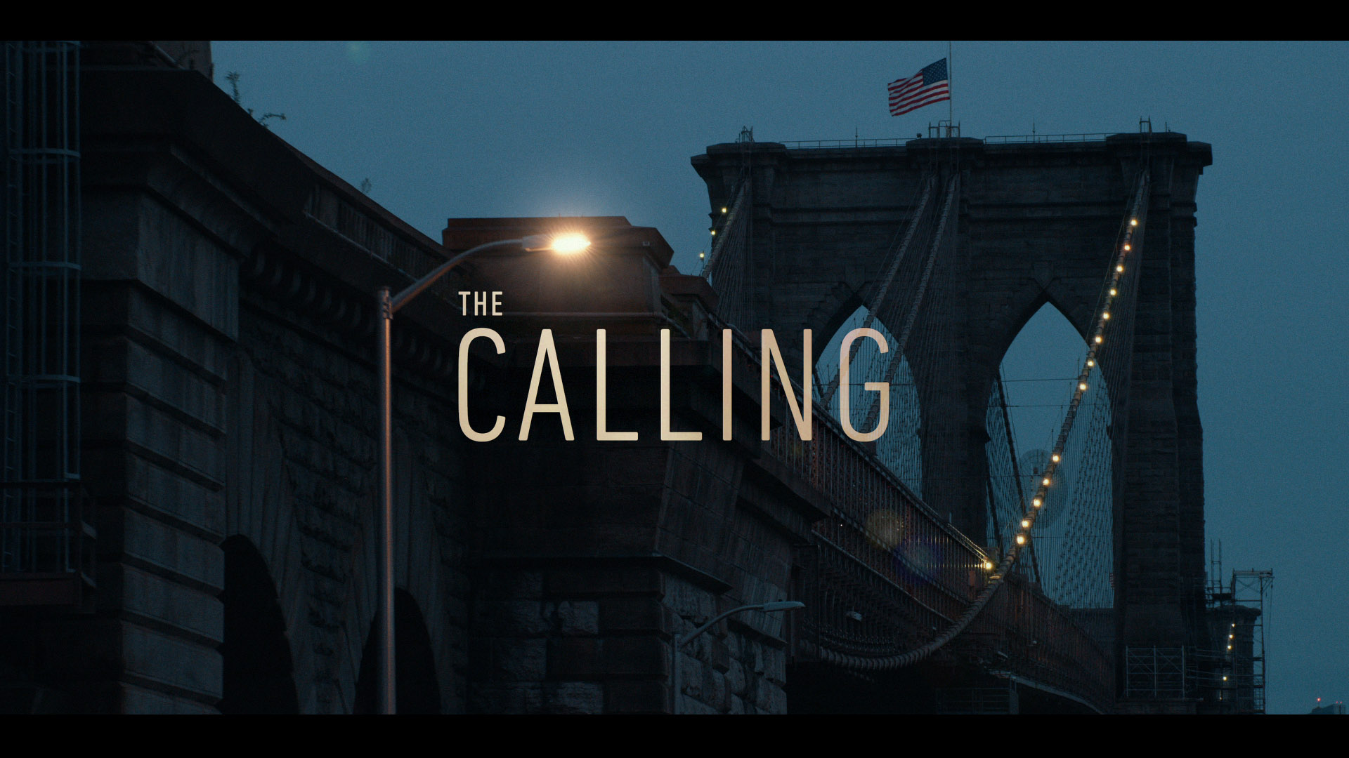
The Calling: Title Sequence
Main titles designed for the Peacock original show The Calling.
-
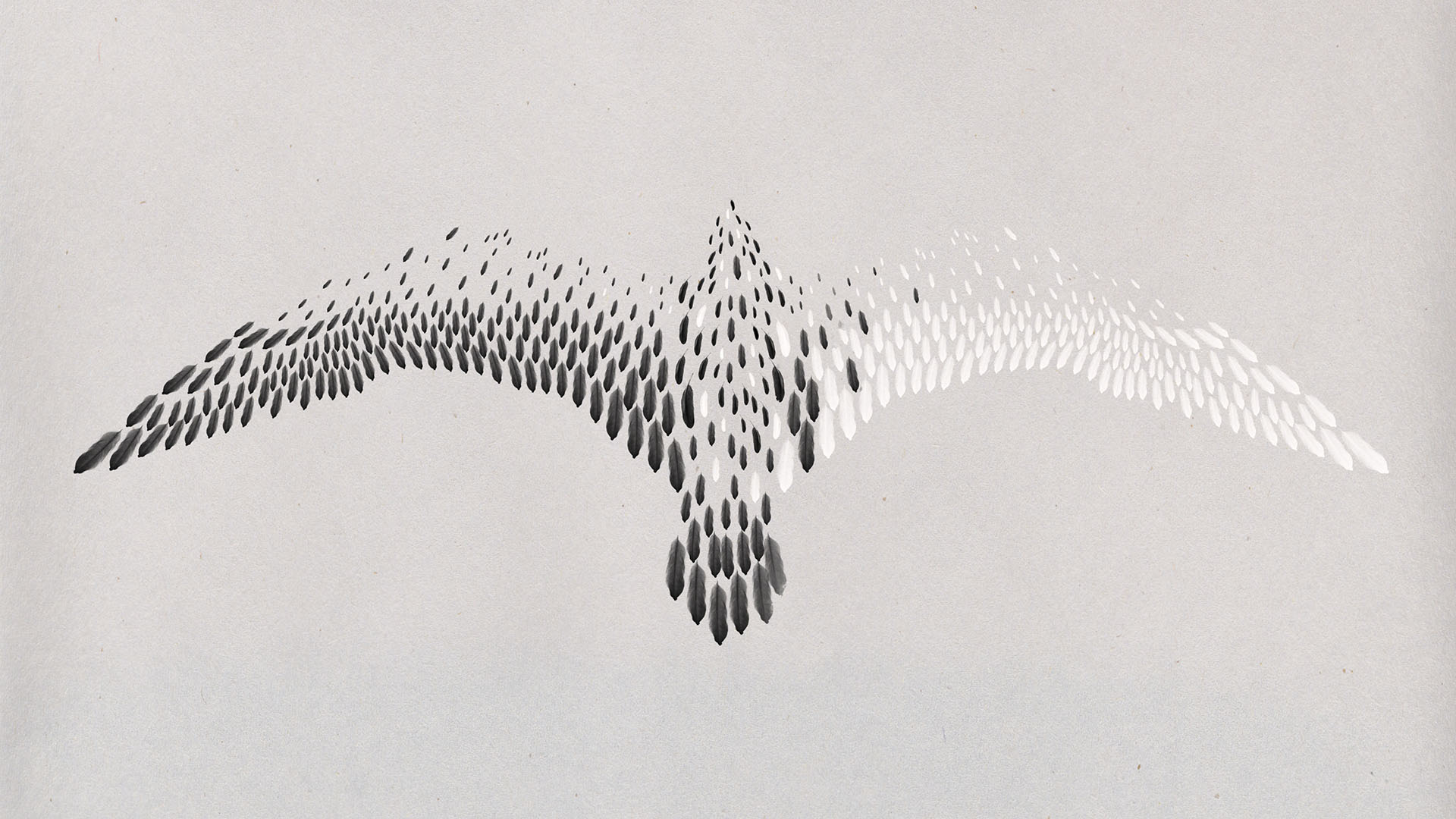
Concepts & Styleframes
Styleframes from the archives and the boneyard.
-
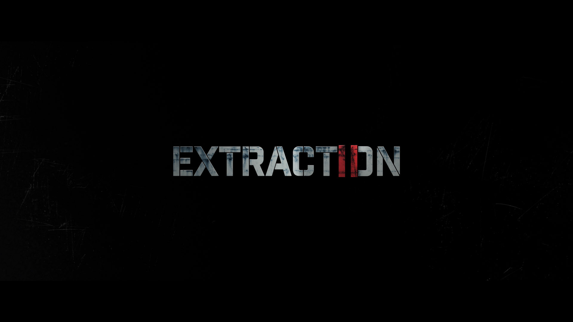
Extraction II: Title Sequence
The sequel to Sam Hargrave’s tour de force ratchets up the impact and intensity and needed a title design that feels spiritually connected to the same classic action films which inspired its aesthetic.
-
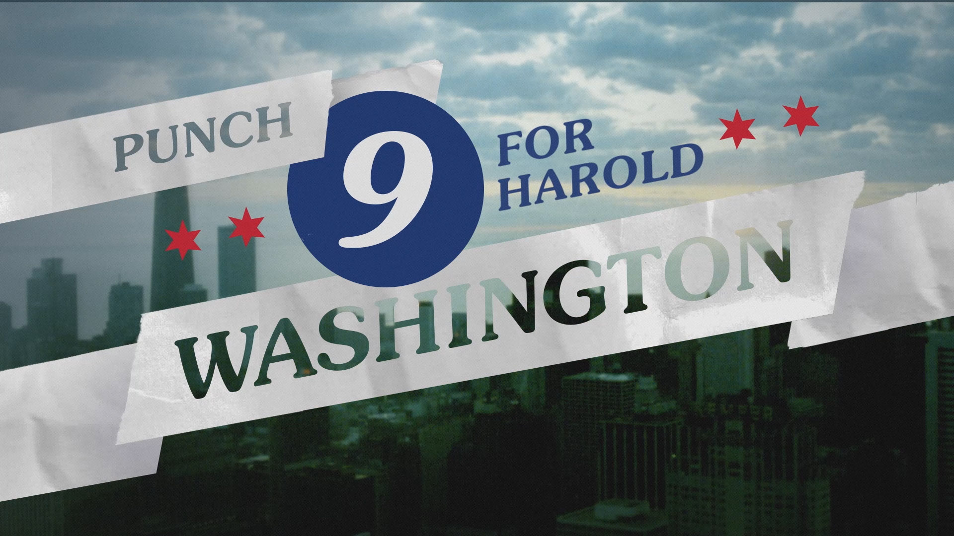
Punch 9: Title Sequence
Punch 9 refers to the campaign to elect Harold Washington as Chicago's first African American mayor in 1983. The title sequence for the documentary film needed to capture the era, the city, and the cultural tensions of the moment; feeling simultaneously vintage and modern.
-
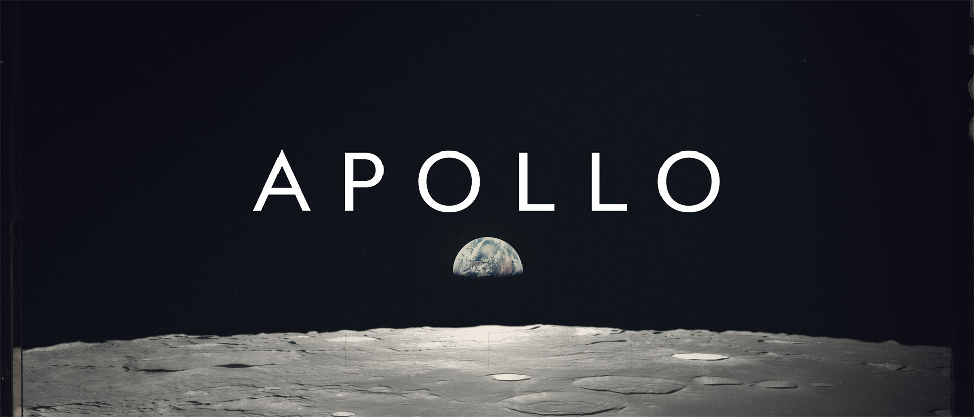
Apollo: Experimental Title Sequence
What began as a small weekend exploration of the NASA Apollo photo archive turned into a multi-month project to create a full-blown title sequence memorializing the missions to the moon.